
Interview With Our Stylist | Colors & Pairings
First, a bit of background about our Stylist, Laura. My dear friend Laura Kackley has been an integral part of Lindsay Letters®, before it even started! Laura was the first female entrepreneur and self-employed businesswoman I ever met, and she managed to build an incredible wedding photography business in a pre-Pinterest, pre-Instagram era. How?! The old-fashioned way: by taking incredible photos that everyone couldn't stop talking about and by being wonderful to work with. (Of course, she also shot my wedding!).

Since 2009, Laura has taken about 95% of the photography for Lindsay Letters®, and her relationship with the brand transitioned quickly from on-call Photographer to someone who played a major role in brainstorming the look, feel, and tone of the collections. What began as late-night texts from me to her saying "Does this look good? Does this all fit together?", etc., transitioned to a more proactive and collaborative approach to brainstorming, mood-boarding, and then creating collections together. (Think of how an art teacher might direct a student in a class room – not so much in technique instruction, but in setting direction, spurring on, creative critiques and so on. This is how Laura and I work together).

In 2019 (yes, it took me ten years to get her!), Laura joined us as the official Art Director for Lindsay Letters®. Her role as an Art Director includes creative direction, shoot direction, and photography, but she (as does our entire team) speaks to most every decision about the brand. Obviously our chemistry, history, and her photography expertise made her a natural and obvious teammate, but something that makes Laura extra exceptional is her extraordinary skills as an interior stylist! Here are a few questions I asked her regarding this part of her role at LL.


Lindsay: Laura, what made you transition from shooting weddings to styling and focusing on interiors?
Laura: In some ways, styling and interiors chose me! It’s in my blood and was only a matter of time. I grew up in my mom's antique store and my dad renovated homes, so I have always been drawn to pretty and meaningful spaces. I got my start in wedding photography which slowly transitioned to commercial photography, which slowly transitioned into styling on set... then, I was doing full-blown interior design before I even realized it! Ha!

Lindsay: One of the first things you did once you joined our team was to tackle color palettes (both seasonal + everyday) for our Lettered Art. This was a really fun process for me to learn about and watch!
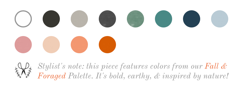
Laura: Certain colors work better in interior spaces than others. Since people are purchasing artwork, we want to offer them colors/palettes that are well suited for interior spaces. Think of how interior paint colors are in a very different spectrum than craft paints. Before I finalize a specific color for a palette, it goes through an extensive testing process to make sure it translates to both canvases and paper the way we want them to, and in a way that it will work well on people's walls, in lots of different lighting. We've recently created color palettes for the Wellspring Collection, Kids Camp!, the Coastal Collection, and Fall & Foraged.
Lindsay: Speaking of collection-specific color palettes, I think you have a cool Stylist's Tip for our clients about that...
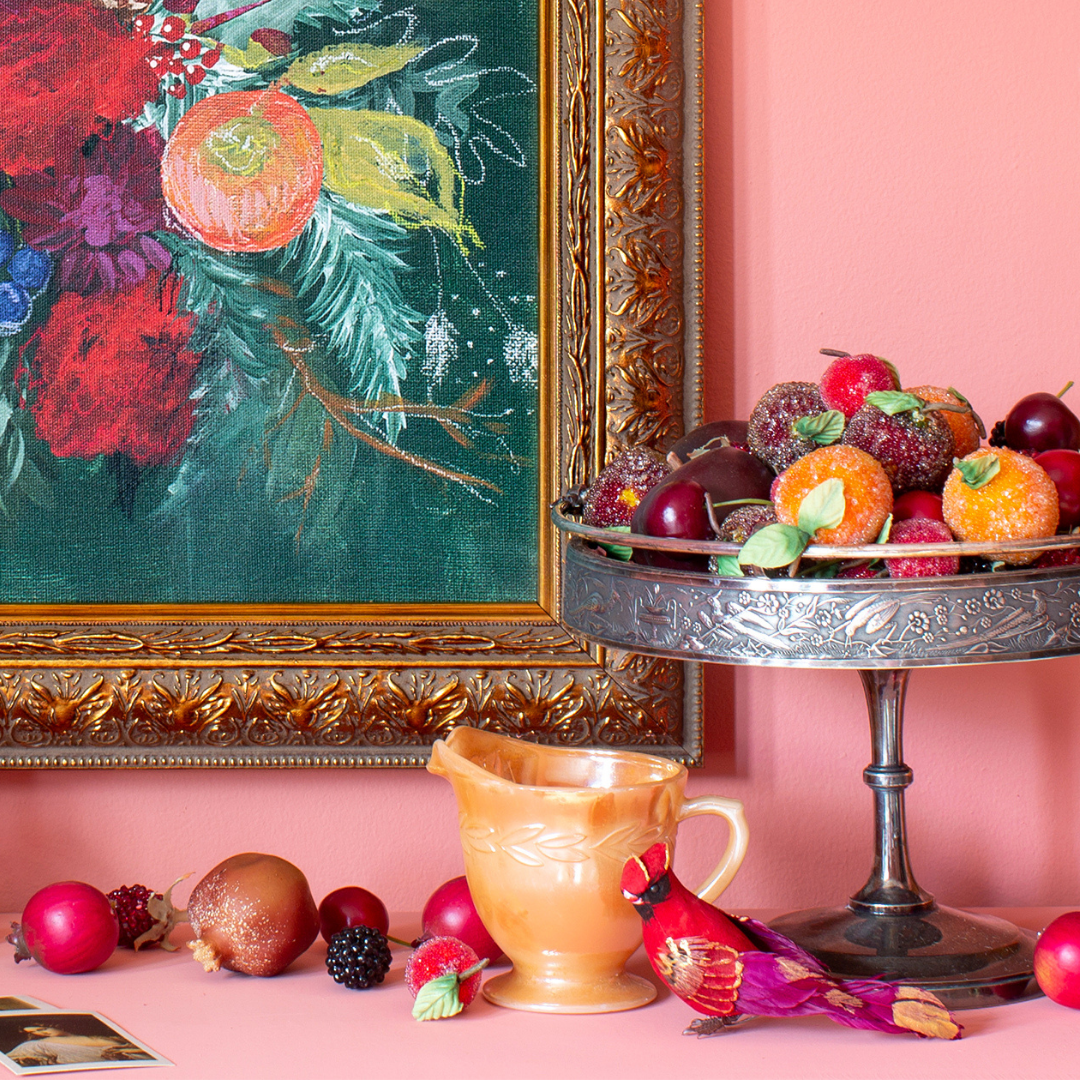
Laura: If you're going to pair a piece of lettered art with a painting, an easy way to make sure the pieces will complement each other in both tone and color is to choose pieces within the same collection. The background colors for the lettered pieces are inspired by the paintings within that same collection. Take for example – the Mauve from the Fall & Foraged palette (seen here) is inspired by the warm hues in Rose & Oak.

Lindsay: Love it! When we first announced that you were officially on our team in an Art Direction & Stylist role, your inbox went crazy with requests. Talk a bit about your most common request.
Laura: It did! The most common question I received, by far, was regarding art pairings. People wanted advice on which pieces of art went together. I realize that these pieces are major investments, and it's sometimes hard to picture something when you're not in person, so I was excited to help our clients in this way!

Lindsay: I'll be totally honest, I did not see that coming! Until you joined our team, I always painted more one-off paintings. I personally mix my artwork so eclectically... seriously, none of my own art collection "matches." But you fielding these questions really opened up my eyes to this desire people had!
Laura: Well for sure it's fun to throw something unexpected in the mix (like one of our Vintage Reproductions or a pop of unexpected color), but I think cohesion creates calm, and that's really what everyone is craving these days.

Lindsay: Totally. So, in response to this ask, we've decided to accommodate this ask in two different ways. First, I've started creating more intentional Duos – art that I painted to intentionally go together (you can see them here). And you, you decided to work on another fun way to help our clients find the perfect partner to the pieces they like, and it is so fun! Tell us about that.

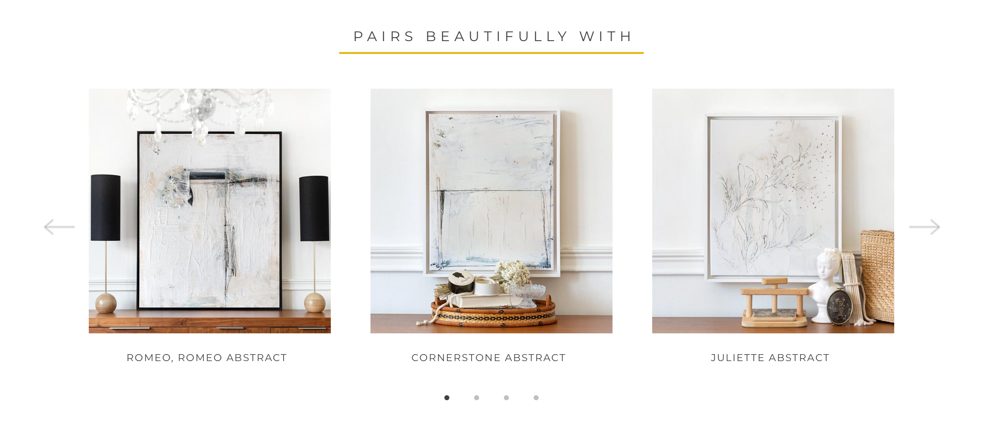
Laura: Yes, I'm thrilled to finally be implementing the "Pairs Beautifully With" Feature! It will take some time for me to work through the entire body of Lindsay's artwork, but right now I'm working my way through the Abstract Art Collection and selecting a few pieces of artwork that I think pair well with each piece. So for example, if you click on Norway Road and scroll down under product details, you'll see the pieces I've chosen that I believe make really good partners to that piece.
If you're interested in artwork that doesn't have any art pairings yet, please don't hesitate to email us at hello@lindsayletters.co and we'll be sure to get back to you with some suggestions!

Lindsay: Ah, that is so exciting! Okay, so, any words of wisdom for someone who is new to, or nervous about, purchasing art for their space?
Laura: Trust your gut! Art speaks to you! Anytime I walk with someone purchasing art, I always start with a handful of their favorites. Then, I take a look at their space to see which fit their aesthetic. Usually people are drawn to a palette...earthy, blues, neutrals, warm tones, cool tones, etc... so it never surprises me when the majority of their favorites already fall into the palette they tend to decorate with. Get what you like!
Lindsay: Can I also add? Please, please measure. Ha! I know, it's a hassle, but having a big huge wall with an itty bitty canvas on it will make you sad. If finances are driving your size decision, we would rather you save your money until you can invest in art that fits your space, trust me! There's also a time & place for tiny art, too, and Laura and I have a fun surprise about that coming later this Fall!
Be sure to look for the "stylist's note" moments that pop up throughout the site – those are Laura's notes and tips for you. We hope these help you to make purchases in joy and confidence! Enjoy! xo, lindsay

Written by Lindsay Sherbondy
Visit author's website


Leave a comment
This site is protected by hCaptcha and the hCaptcha Privacy Policy and Terms of Service apply.