20% off Select Art! ☀️ *discount will appear in cart!* 😎 Shop the Sale! →

my account   |   my rewards   |   wishlist   |   0 items: $0.00
X

Your cart

Your cart is currently empty. Let's fix that! Browse the latest BEST SELLERS!

12 Sep 2020

Interview With Our Stylist | Colors & Pairings

blog post by Lindsay Sherbondy

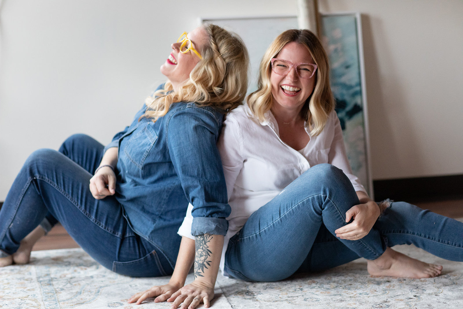
First, a bit of background about our Stylist, Laura. My dear friend Laura Kackley has been an integral part of Lindsay Letters®, before it even started! Laura was the first female entrepreneur and self-employed businesswoman I ever met, and she managed to build an incredible wedding photography business in a pre-Pinterest, pre-Instagram era. How?! The old-fashioned way: by taking incredible photos that everyone couldn't stop talking about and by being wonderful to work with. (Of course, she also shot my wedding!).

Since 2009, Laura has taken about 95% of the photography for Lindsay Letters®, and her relationship with the brand transitioned quickly from on-call Photographer to someone who played a major role in brainstorming the look, feel, and tone of the collections. What began as late-night texts from me to her saying "Does this look good? Does this all fit together?", etc., transitioned to a more proactive and collaborative approach to brainstorming, mood-boarding, and then creating collections together. (Think of how an art teacher might direct a student in a class room – not so much in technique instruction, but in setting direction, spurring on, creative critiques and so on. This is how Laura and I work together).

In 2019 (yes, it took me ten years to get her!), Laura joined us as the official Art Director for Lindsay Letters®. Her role as an Art Director includes creative direction, shoot direction, and photography, but she (as does our entire team) speaks to most every decision about the brand. Obviously our chemistry, history, and her photography expertise made her a natural and obvious teammate, but something that makes Laura extra exceptional is her extraordinary skills as an interior stylist! Here are a few questions I asked her regarding this part of her role at LL.

Lindsay: Laura, what made you transition from shooting weddings to styling and focusing on interiors?
Laura: 
In some ways, styling and interiors chose me! It’s in my blood and was only a matter of time. I grew up in my mom's antique store and my dad renovated homes, so I have always been drawn to pretty and meaningful spaces. I got my start in wedding photography which slowly transitioned to commercial photography, which slowly transitioned into styling on set... then, I was doing full-blown interior design before I even realized it! Ha!

Lindsay: One of the first things you did once you joined our team was to tackle color palettes (both seasonal + everyday) for our Lettered Art. This was a really fun process for me to learn about and watch!
Laura: Certain colors work better in interior spaces than others. Since people are purchasing artwork, we want to offer them colors/palettes that are well suited for interior spaces. Think of how interior paint colors are in a very different spectrum than craft paints. Before I finalize a specific color for a palette, it goes through an extensive testing process to make sure it translates to both canvases and paper the way we want them to, and in a way that it will work well on people's walls, in lots of different lighting. We've recently created color palettes for the Wellspring Collection, Kids Camp!, the Coastal Collection, and Fall & Foraged

Fall Color Palette
Lindsay: Speaking of collection-specific color palettes, I think you have a cool Stylist's Tip for our clients about that...

Laura: If you're going to pair a piece of lettered art with a painting, an easy way to make sure the pieces will complement each other in both tone and color is to choose pieces within the same collection. The background colors for the lettered pieces are inspired by the paintings within that same collection. Take for example – the Mauve from the Fall & Foraged palette (seen here) is inspired by the warm hues in Rose & Oak.

Lindsay: Love it! When we first announced that you were officially on our team in an Art Direction & Stylist role, your inbox went crazy with requests. Talk a bit about your most common request.
Laura: It did! The most common question I received, by far, was regarding art pairings. People wanted advice on which pieces of art went together. I realize that these pieces are major investments, and it's sometimes hard to picture something when you're not in person, so I was excited to help our clients in this way!

Lindsay: I'll be totally honest, I did not see that coming! Until you joined our team, I always painted more one-off paintings. I personally mix my artwork so eclectically... seriously, none of my own art collection "matches." But you fielding these questions really opened up my eyes to this desire people had! 
Laura: Well for sure it's fun to throw something unexpected in the mix (like one of our Vintage Reproductions or a pop of unexpected color), but I think cohesion creates calm, and that's really what everyone is craving these days. 

Lindsay: Totally. So, in response to this ask, we've decided to accommodate this ask in two different ways. First, I've started creating more intentional Duos – art that I painted to intentionally go together (you can see them here). And you, you decided to work on another fun way to help our clients find the perfect partner to the pieces they like, and it is so fun! Tell us about that.


Laura: Yes, I'm thrilled to finally be implementing the "Pairs Beautifully With" Feature! It will take some time for me to work through the entire body of Lindsay's artwork, but right now I'm working my way through the Abstract Art Collection and selecting a few pieces of artwork that I think pair well with each piece. So for example, if you click on Norway Road and scroll down under product details, you'll see the pieces I've chosen that I believe make really good partners to that piece.

pairs

If you're interested in artwork that doesn't have any art pairings yet, please don't hesitate to email us at hello@lindsayletters.co and we'll be sure to get back to you with some suggestions!

Lindsay: Ah, that is so exciting! Okay, so, any words of wisdom for someone who is new to, or nervous about, purchasing art for their space?
Laura: 
Trust your gut! Art speaks to you! Anytime I walk with someone purchasing art, I always start with a handful of their favorites. Then, I take a look at their space to see which fit their aesthetic. Usually people are drawn to a palette...earthy, blues, neutrals, warm tones, cool tones, etc... so it never surprises me when the majority of their favorites already fall into the palette they tend to decorate with. Get what you like!
Lindsay: Can I also add? Please, please measure. Ha! I know, it's a hassle, but having a big huge wall with an itty bitty canvas on it will make you sad. If finances are driving your size decision, we would rather you save your money until you can invest in art that fits your space, trust me! There's also a time & place for tiny art, too, and Laura and I have a fun surprise about that coming later this Fall!

Be sure to look for the "stylist's note" moments that pop up throughout the site – those are Laura's notes and tips for you. We hope these help you to make purchases in joy and confidence! Enjoy! xo, lindsay

05 Mar 2020

Update on Lindsay + Team Picks for Spring

blog post by Joy Neal

* This post was originally an email on March 5, 2020 

Rosie Horizon Abstract

Hello, friends,

Lindsay is home and we're happy to report that her recovery is going very well. She experienced some crazy side effects and a lot of fatigue—all to be expected after widespread infection. But the side effects are diminishing and she's steadily regaining energy. I know she appreciates continued prayer as she continues to rest, heal, and go through all of the follow-up appointments. 

(For those of you who might have missed the first email and aren't on social, you can read about what happened in this blog post of the original email.

We don't like dwelling on how scary a couple of those days were, but we remember them enough to be very grateful for this outcome. Thank you for praying, hoping, and believing, and thanks for all the kind messages of support.

Little White Barn II

We've spent a lot of time ruminating on hope and healing these past few months, and here we find ourselves in the season for it. Spring. Easter. New life.

Most of our team lives in the Midwest, where Spring is never a straightforward affair. Last Sunday I wore a dress and no jacket, basking in the warmth of 62 degrees. The next day I walked my son to school with freezing-hail-snow bouncing off the sidewalk like styrofoam. Nature has to undergo such a dramatic transformation to get from freezing temperatures to green summer days. It isn't always a graceful transition, but it is an awe-inspiring one.

Waterfall Abstract

You'll be seeing some exciting new things in the shop later this month, as Lindsay wraps up creation of a brand new collection, coming late this month. She's created some really beautiful and meaningful new pieces that we can't wait to share with you.

In the meantime, our art director Laura curated some perennial favorites for this winter-to-spring transition. I asked the team if they'd each share their current favorite from the Spring Picks Collection, which I've been scattering through this email.

The piece I'm feeling most for this Spring is Lindsay's Little White Barn Abstract II (two above). Laura's selection (above) is Waterfall Abstract. Beth's is Bouquet Abstract and Melissa's is Milk & Honey (pictured together below).

Bouquet Abstract

I put Lindsay's pick at the top of this email: Rosie Horizon Abstract. Isn't it an amazing piece? It fills me with a sense of calm anticipation. There's a beautiful story behind it, too, which you can read in the "about" dropdown in the product listing.

We hope you enjoy browsing the Spring Picks Collection and finding something to freshen your space for the new season.

We don't have any control over how many snowfalls are left or what the sun is doing day-to-day—or really over much of anything, really. But we do have control over what we put on our walls, and we really believe in the impact that art can have on our hearts, minds, and well-being.

xo,
The LL Team
02 Apr 2019

April Mood Board :: Vacation Vibes!

blog post by lindsay sherbondy

Happy April! In true April fashion, the weather has been all over the place. We've had bouts of warm weather and then flurries of snow today, so there you go – Spring in the Midwest! After a brief but beautiful vacation to Akumal, Mexico  over the winter, I've had vacation vibes on my mind and heart! This month's Mood Board was created with that in mind. You can see the extended version of the mood board on Pinterest, and shop the April Mood Board Collection!

April Mood Board

Here are some of my favorites from the Mood Board!

Blush Bungalow Abstract Painting

Blush Bungalow

This awesome swimsuit from ModCloth

The Reese One Piece Swimsuit

I loved wearing this SUPER COMFY dress out to dinner! (I got color 012-red)

The next night, I paired these amazing Noonday Resort Earrings with a comfy cotton black dress and that's all I needed!

Noonday Collection Resort Earrings

  Wilder Waters Abstract Art

I hope this month's mood board leaves you feeling happy and inspired! Don't forget to check out the extended April Mood Board on Pinterest – there's all kinds of fun goodies there! xoxo, lindsay 

14 Dec 2015

2015 Holiday Home Tours & Lindsay Letters!

blog post by lindsay sherbondy

the decor fix : holiday home tour / Lindsay Letters Pine On Snow Art

One of the things I love most about this season is the decking-the-halls part of Christmas. Jesus truly is the reason for the season and I know it's not all about the muss and fuss of making a space beautiful, but for someone that is creatively inspired by spaces, getting to see all these homes in their festive best delights me to my creative core. And I think at the very heart of this holiday decorating is the effort of hospitality. We want to make our homes appealing and cozy, to welcome in our friends and families and communities, giving them a place to feel celebratory and joyful. And you know what I say to that? HOORAY!!!!

the decor fix : holiday home tour / Lindsay Letters Soul Felt Its Worth Art 

I also really love getting to see all the various styles of decorating. It's so fun to see how people's personalities come to life in the way they decorate their homes. Cozy, quirky, moody, fancy, rustic, and everything in between. I also love that this isn't about money spent or even loads of time. So many of these home tours I've had the privilege of being a tiny part of are more about working with what you have, in the time you have, and throwing in a few creative DIYs to round it all out. 

city farmhouse : simple tips for outdoor decorating / Lindsay Letters Blizzard Campfire Mug

city farmhouse : cozy christmas cabin house tour
Lindsay Letters White Christmas Snow Typography Art / Lindsay Letters Spark In The Woods Abstract Art

life on virginia street : preppy plaid holiday home tour // Lindsay Letters It Is Well Art

Lindsay Letters The Original O Holy Night Art

Lindsay Letters Bethlehem Art

Lindsay Letters Doxology Art
 

inspired by charm : holiday home tour 2015

LL buddy singing loud print / LL buddy the elf print

paige knudsen : merry christmas! welcome to our home / LL pine on snow canvas

Paige pinned the pine on snow postcard from the LL abstract postcard set on to her beautifully curated board. Actually, it seems that Pine on Snow Watercolor ended up being a blogger favorite this year! (You can see it over at Restoration House Interiors, too!) And I'm thrilled. I love creating those abstracts as part of the LL Canvas Shop, and it's really satisfying for me to see those pieces in different homes and styled in so many different ways!
And on that note, just a little thank you to everyone who has welcomed my art into their home this year. That truly is the best part of my job – I LOVE seeing you love it, and making these pieces your own. Thank you thank you thank you from the bottom of my heart!
I hope this little sampling of holiday homes leaves you feeling inspired and expectant for what this season holds for you. Whether you're going to be entertaining large groups or snuggled in as a cozy few, my prayer is that you are enjoying these moments in a space that feels like "you." A very festive you. If you find yourself with some time, or are curious about other elements in these photos, please do click on the links for the original home tours. And if you do, better pour yourself some hot cocoa first – you're about to get lost in dreamy lands of garland and love!
xo, lindsay 
p.s. keep sharing! don't forget to tag @lindsay_letters on instagram!
25 Nov 2015

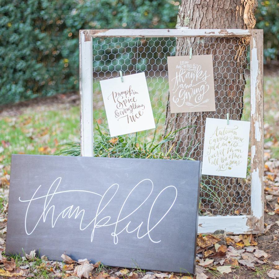
Lush Outdoor Thanksgiving on SMP Living

blog post by lindsay sherbondy

Lexi from Glitter, Inc. always has something chic and festive up her sleeve, and this beautiful woodland Thanksgiving spread is no exception!

I was an honor to have some LL prints & canvases featured in the styling, and I was tickled to see it all featured over at Style Me Pretty Living!

We Love You, Fall Print

Canvas + Prints from the 2015 Autumn Collection

photography by Brandi Leigh | tablescape Serendipity Designs

You can see more images and read about all the details right here! Happy Thanksgiving! 

p.s. Last week was an incredible week, because Phoenix Brave was born!!! We are over the moon in love with this sweet guy!